More than meets the eye: debunking of the display typefaces
Author: Maria Doreuli
Date: 09/01/2020
This article is a recap of a talk I made at Fontstand conference in Porto in May 2019. I find the subject still relevant and I hope my thoughts on the matter will be of some value to you.
Wikipedia
Display typefaces often have more eccentric and variable designs than the simple, relatively restrained typefaces generally used for body text. They may take inspiration from other genres of lettering, such as hand-painted signs, calligraphy or an aesthetic appropriate to their use, perhaps ornamented, exotic, abstracted or drawn in the style of a different writing system. Several genres of font are particularly associated with display setting, such as slab serif, script font, reverse-contrast and to a lesser extent sans serif. Walter Tracy defines display typefaces in the metal type sense as “sizes of type over 14 point” and as for design, he states that “text types when enlarged can be used for headings, display types, if reduced, cannot be used for text setting”.
I’ve been wondering for a long time—why are there so many prejudices against display typefaces? I even started collecting type designers’ quotes on that matter, that seemed particularly strict.
“A typeface is too complex to accidentally come out well. And I’m talking about proper fonts here, the ones intended primarily for long reading. A dashing display typeface can be made even by a teenager…”—Yury Gordon, interview on godesigner.ru (translated from Russian).
“It is better not to spread fonts for ‘random’ purposes at all… I do not know cases when a display typeface contributes to typographic relish. In typography for the external effect and fun (the typographer and the viewer), ‘text fonts’ are more successful”—Vladimir Krichevsky, typejournal.ru (translated from Russian).
“I consider myself mostly a text type designer. It is not that I don't like display typefaces… I think it is more helpful for Cyrillic typography to design something that people are lacking and that fewer type designers can do. You can see that almost all of my display fonts were more or less quick projects—a kind of procrastination during long and serious projects…”—Alexandra Korolkova, interview on MyFonts.
And I’ve deduced the most common myths concerning display fonts:
● Display typefaces are the same thing as lettering. We often confuse these, which is understandable, because many typefaces take inspiration from lettering, calligraphy, handwriting, etc. Yet, while lettering is just a single illustration, letters of the typeface are meant to work in any possible combination to be used in a variety of projects. Hence, the second myth.
● They’re easy and quick to make. Usually, the first assignment that a graphic designer is given while studying, is a display typeface. My very first typeface was also a display one: its name was Pupiri and it was based on a handwritten sketch. I drew it back in 2008 while trying to do really anything and at the same time learn about the font editor and the relationship between styles and weights. But in no way this should lead to a conclusion that display typefaces are only a field for experimentation for beginners.
● They’re just for fun, nothing more. Type design is a serious profession, where no fun is allowed. A proper type and graphic designer should invest his time into more complex assignments like… text typeface. Nonsense! While both text and display typeface projects can be enriching and exciting, I believe that creating an original display typeface gives you much more room for learning and professional development. At last, it requires a lot more creative thinking than most other genres.
● They’re single usage fonts. A typeface needs to solve serious problems like legibility, new file formats, low resolution printing. And a display typeface does not solve any problems, and on top of that you can use a display typeface just once for a specific project and that’s it—what a waste of time to design such a thing! But in fact, typeface’s genre doesn’t predetermine, if it’s going to be popular or not. And even if we assume that display fonts sell less, it doesn’t always have to be about the sales rate. When some project catches the eye of the audience and shakes the industry, it simultaneously turns the spotlight on the other, more neutral and less publicly acclaimed cases.
That’s endlessly debatable, and .. I’d rather share my personal experience and thoughts on the subject. Since I started working on Chimera in 2012 I got to an understanding that display typefaces have much more to offer than it may seem at first sight. And the more these beliefs clashed with my reality, the more offended I’d feel when hearing them. And you’ll hopefully understand why, after reading this article. But first, let’s dive into history.
Typefaces for large sizes started to appear only in the 19th century. Before that lettering and calligraphy were used for the same purpose. Maybe the fact that display type design is still young, makes us treat it as lettering? As if it was a single-purpose thing.
At this point I remembered a research of my colleague from Contrast Foundry Liza, that she made on slab-serifs, and decided to take a look at the history. Specifically at the times when first display types appeared. These kinds of letters with heavy square serifs first emerged on the signs in London and were probably the ones that inspired first bold Egyptian typefaces meant for large sizes (see image 1), which in their turn lead to the creation of Clarendon typefaces in the beginning of the 19th century (see image 2). These last ones were the first to be used as bold text faces and later evolved into a new text typeface category.
I was super excited when I came to these conclusions. I think it’s a great example that shows a direct overlap between text and display genres and how Roman typefaces influenced by Egyptian display typefaces evolved into Ionic/Clarendons. The story might be more complex, but I would still claim to say that slab-serifs were among the first serif typefaces that made it from headlines to small text sizes and changed the serif text typeface scene by doing so. It might have been one of the first and most striking examples of how lettering and later display fonts influenced the formation of a new category of text fonts.
Let’s turn to our time. These days I don’t see any magic in designing a neutral text typeface. There are a lot of great examples from the past, and new ones keep appearing,—yet we see less original, mind blowing, revolutionary designs and an increasing number of interpretations of the classics.
Anyone can create a text typeface: the tools are becoming more and more accessible, “the rules” are pretty clear and the only thing one needs to do is to learn them, train the eye. These rules and knowledge are based on decades of work of punch cutters, printers, typographers, so we have a lot of examples to look at and analyze. Yet studying existing designs won’t necessarily lead to create something different and unique. And the numerosity of similar projects emerging these days, caused by all of the above, sparks a lot of talks about originality in type design.
What I believe in is that it is display fonts that are engines of progress. They inspire and push you to experiment more and can be a good premise to create new text fonts. So it’s important to get rid of all the prejudices and draw more of display typefaces.
I’ve seen a rapidly growing amount of reversed typefaces since 2012. This is a tweet from May 2019 by Typographica: “So many reverse-contrast typefaces in 2018–19. How long until our concept of ‘standard contrast’ and ‘reverse contrast’ is reversed?”. This is just one of the proofs that the amount of releases is antithetically different. There are both wild display and more neutral text reversed contrast typefaces appearing. Who knows maybe this will lead to something new happening in type design?
You may have already noticed that I became very interested in the ways text and display typefaces feed each other and how different ideas in these genres overlap. And I started analyzing this in my own work.
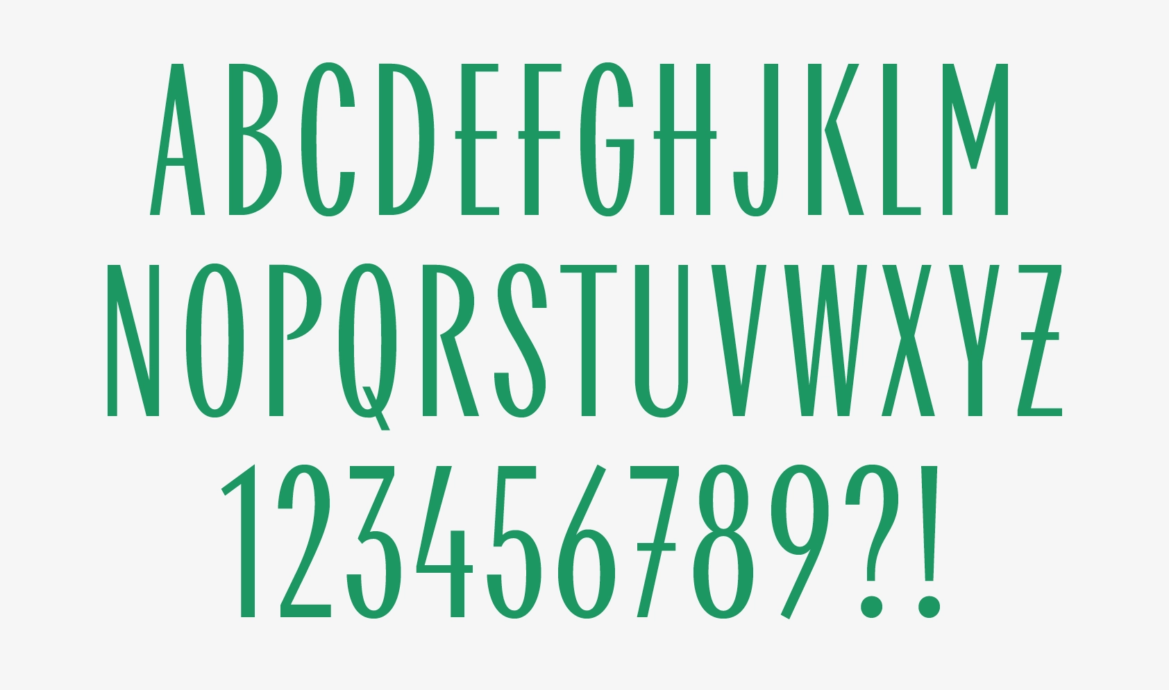
Below is a comparison between my typefaces William Text and Chimera that shows how many similarities are in these typefaces. You probably would’ve never noticed them if I wouldn’t have pointed out.
Even though William and Chimera may have some common features, the impression they make is totally different. And while William is a “serious typeface” it was yet Chimera that challenged me the most.
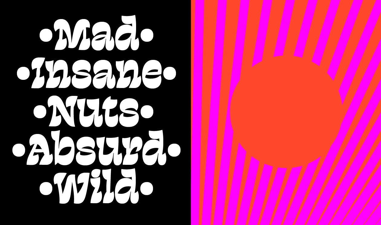
We hear way too often that typefaces should solve problems, and by hearing that we assume that typefaces always need to have a particular application. But fonts also introduce emotion to typography—another important aspect worth exploring and working on. This is exactly how Chimera started—as a display typeface, an idea that evolved from five letters which I adored and ended up designing a typeface in five styles out of them.
In order to complete Chimera I had to force myself to forget about everything I knew from before. Designing it required a different mindset then the one I was used to when designing a text family. And since then I use this design process all the time. Whenever I work on a logo or a typeface, neutral or not, I start sketching. Often, a more extravagant sketch calms down with time. While if you take off from a bland design it is nearly impossible to bring character to it and then you start spinning ideas out of thin air and introducing weird details.
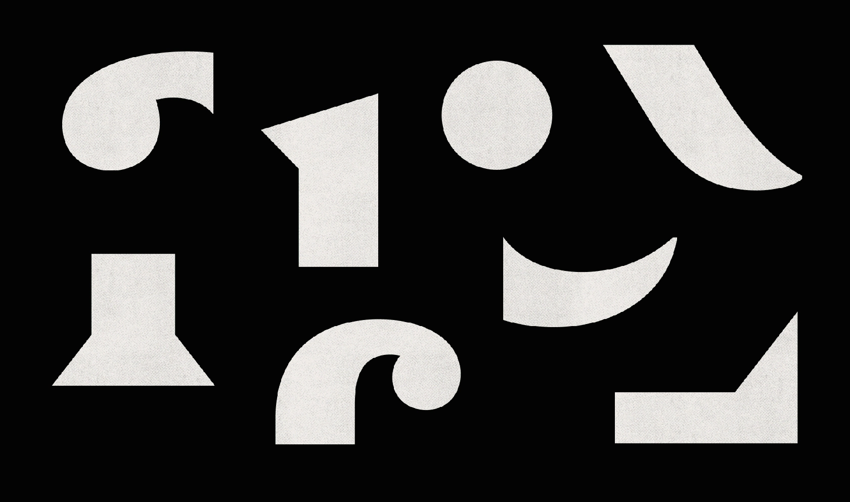
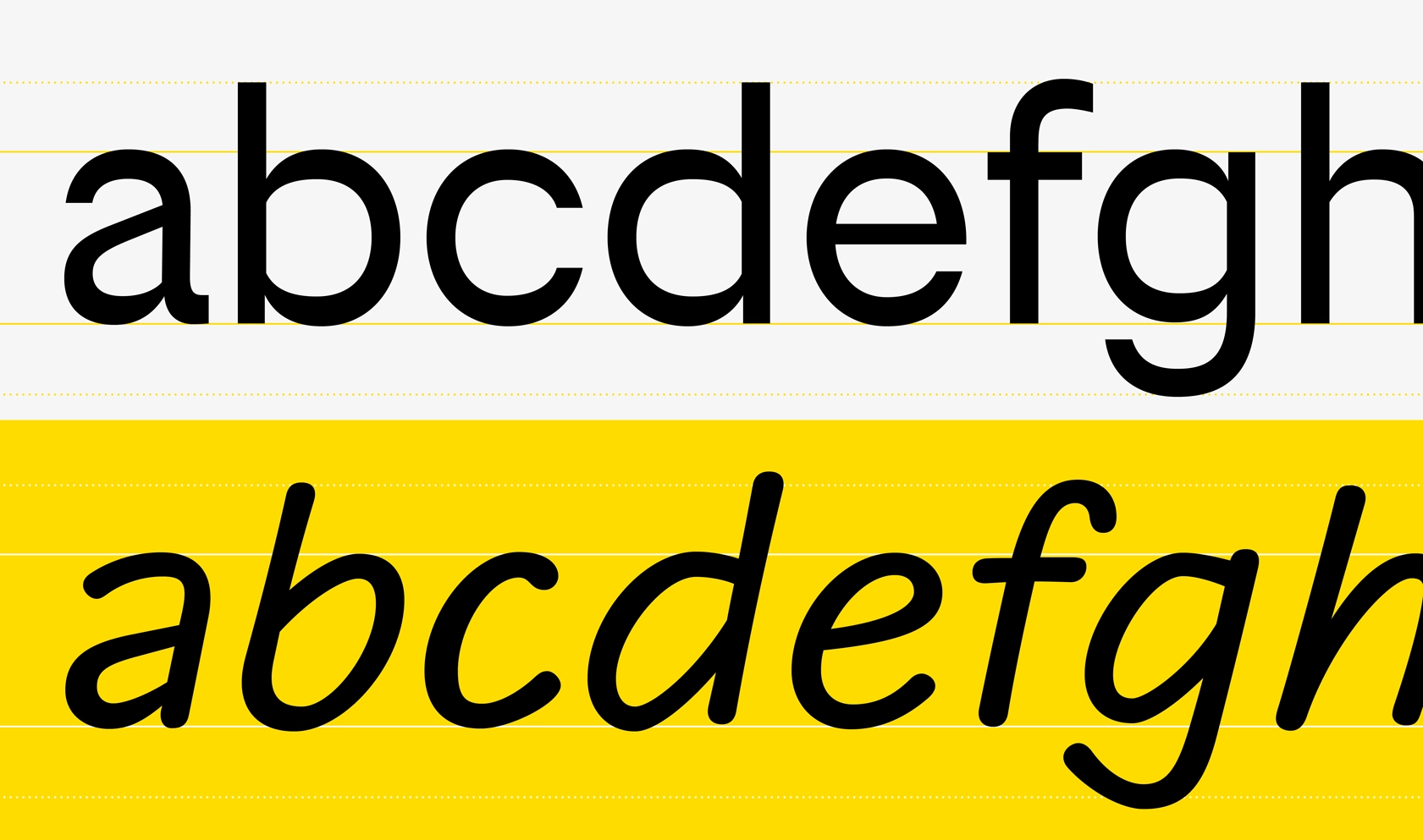
At the bottom you can see one of the sketches that I developed into a typeface CoFo FlicFlac. It is a rounded modular font, but the module is so simple and bold that it makes it tricky to design complex shapes.
One of the trickiest ones was probably Cyrillic Ф. Ф is normally constructed as a combination of an O and a vertical stroke. But in FlicFlac the O has such a small counter shape that it’s obvious that trying to put something inside of it will not work. I experimented with different approaches—using both O and P as a basis for the Ф, but none of these attempts worked out. It was only when I started looking at this letter as a form of its own, a combination of black and white when I found a suitable solution.
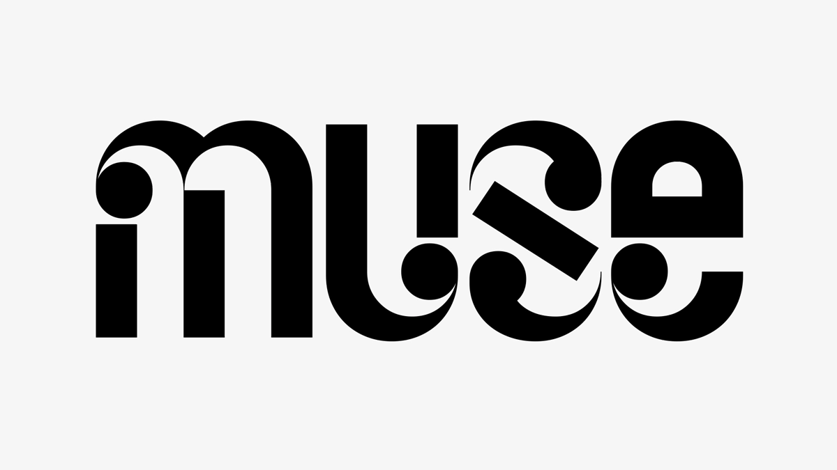
The reason why I am showing this is that suddenly I saw a few examples of people using the same DNA in their designs. I am not sure if this Ф is an invention of mine, but it most certainly became a reference for designers—the new logo of the design factory space Flacon in Moscow by Shuka Design and the Ф created by Mark Kholodaev.
As much as I like to do it myself, I would like designers to experiment more with letters’ DNA. I believe that new original display typefaces will start affecting text ones more and more. And these overlaps between text and display genres are what is most interesting to me at the moment. Summarising my experience with Chimera I’ve collected some things that helped me along the way.
Tips & tricks
It is when your idea is shaped clearly and the forms are settled, that the point structure gains ground. We’re usually taught that the less points on the outline you have—the better. This is true in many cases, when you’re aiming at pure forms. But if you want to achieve a more complex curve—it simply wouldn’t work. The more unusual your shapes are the more you realize that you need to add a lot of extra points to get the right form.
My outlines, especially in the beginning, were very messy. But moving towards the end of the process, I’d clean them up very slowly.
More consistency isn’t always better. Here, as an example you can see William Text and compare how different the treatment of the details is:
—All the vertical elements are slightly different. Their thickness and even their curvature varies;
—Only a few of the serifs in Chimera are identical, most of them differ from glyph to glyph. They occupy just as much room as it’s left (they also look like dutch shoes if you haven’t noticed);
—Many of the elements that are usually more or less the same are different in Chimera.
Everything you just saw is a result of calming things down and reducing irregularities. In the beginning everything was much more wild. My strategy was to keep the forms as inconsistent as possible, so that I wouldn’t make decisions based on just one form but rather on the whole typeface.
Here are few tips on how to break common patterns and design something different:
● Sketch. Start with a mess and then clear it up.
● Don’t sacrifice the character. Tools that we use nowadays give us a lot of opportunities to keep things consistent. They allow us to reuse as many elements as possible, they measure and warn us when something is off, they even harmonize our outlines. It is even possible to create a typeface by arranging pre-existing forms. But don’t let tools that you are using trick you into creating a generic soulless design.
● Avoid copy and pasting. Try not to measure or draw on the grid. Train your eye.
● Learn not to take yourself and your knowledge too seriously. The more you learn, the more confidence you get in what you are doing, yet it’s a dangerous moment. Because actually there are no such rules that would work for every single designer and in every single case, so it’s only good to forget what you've learned and make up your own rules.
● Remember: everybody is different.
● Experiment more with crazy display styles to bring something unique to the text designs.
Further reading:
—The Bold Idea: The Use of Bold-looking Types in the Nineteenth Century Michael Twyman
—Slab-serif Type Design in England 1815–1845 Nicolete Gray
—Three Chapters in Development of Clarendon/Ionic Typefaces Mitja Miklavčič
Editor: Susanna Agabayan


